Gabriel Martin

Portfolio · UX Architect / Designer / Engineer

I make products usable by everyone, and deliver designs structured for engineers to build with confidence.

I’m a UX designer and front-end developer with 15 years of experience, specializing in accessibility (WCAG 2.1 AA, Section 508, VPAT/ACR), design systems, and interactive prototyping. Currently available for contract work.

Education · MIT xPRO, Designing & Building AI Products & Services

Gabriel speaking to a room with a microphone in hand, in front of a bright window.
The start of my UX journey, 2014

Selected design work, with rebuilt artifacts you can try. For the story behind three projects, read the case studies.

Innovative Driven

Product Architect / UX Designer · UX research, process mapping, client onboarding

I led the UX research and design of an LLM-based eDiscovery tool, adopted by dozens of law firms. I also owned product design and ran the team’s Azure DevOps board as its PM.

When I joined, onboarding a new client took two weeks. I mapped the existing flow in Figma, from a contract closing in Salesforce to a ready eDiscovery instance, to show every handoff and bottleneck. We used that map in stakeholder strategy meetings, I scoped the work as an epic and wrote the tickets, and the developers built and iterated on it. Onboarding went from two weeks to 15 minutes.

Client onboarding as an org flowchart, from a contract closing in Salesforce Sales Cloud to case setup and the setup complete notification. Colors show which part of the company is involved and shapes show what each node is: Client Services, Platform Engineering, IT, and HR feed data in, and the steps themselves are redacted. Redrawn for this page, with no client data.

Quickbase Pipelines

Sr. Interaction Designer (contract) · Information architecture, interaction design, prototyping

Pipelines lets Quickbase customers connect their data to other services and automate the work in between. The existing drag-and-drop builder was hard to read and hard to learn. Working with a UI designer I designed comps for establishing a familiar and intuitive information architecture, and interaction design guidelines for the node-based replacement. Using familiar iconography to existing users, we designed the node cards to surface the data that users most needed to know while collapsed, and detailed information while expanded. We prototyped in Figma, and early versions were built in LiteGraph, so internal testers could easily experience the new version 2.0 during testing.

I led wireframing and interactive prototyping for the new builder and ran workshops with SMEs, engineers, and UX researchers to set the technical scope. Users in the private beta gave it 95% positive feedback.

  1. Quickbase trigger: when a record is added to Projects
  2. Quickbase search: find the matching row in Budgets
  3. Condition: if the budget is over $50,000. If yes, send a Slack message to #finance; if no, create a calendar kickoff event.
A working sketch of the builder’s structure: steps flow top to bottom, each opens to its data with the connection folded away, and one search covers every channel. Add a step, change the test budget, run it. Redrawn for this page.

Virgin Pulse: The Convergence of UX & Engineering

UX Design Engineer · Accessibility strategy, training, pattern library, rewards, partner API

From my experience, accessibility at large orgs doesn't fail because people don't care. It fails because the people who care are speaking different languages.

Virgin Pulse was already pushing for better WCAG compliance when I joined, but the effort was stalling. Engineering leadership was struggling to normalize internal best practices, and the product team had little familiarity with responsive UI or resizable text. I came in to bridge that gap, taking a federated approach and building buy-in across both orgs rather than pushing mandates from the center. Then I gave both sides tools and a language they could share.

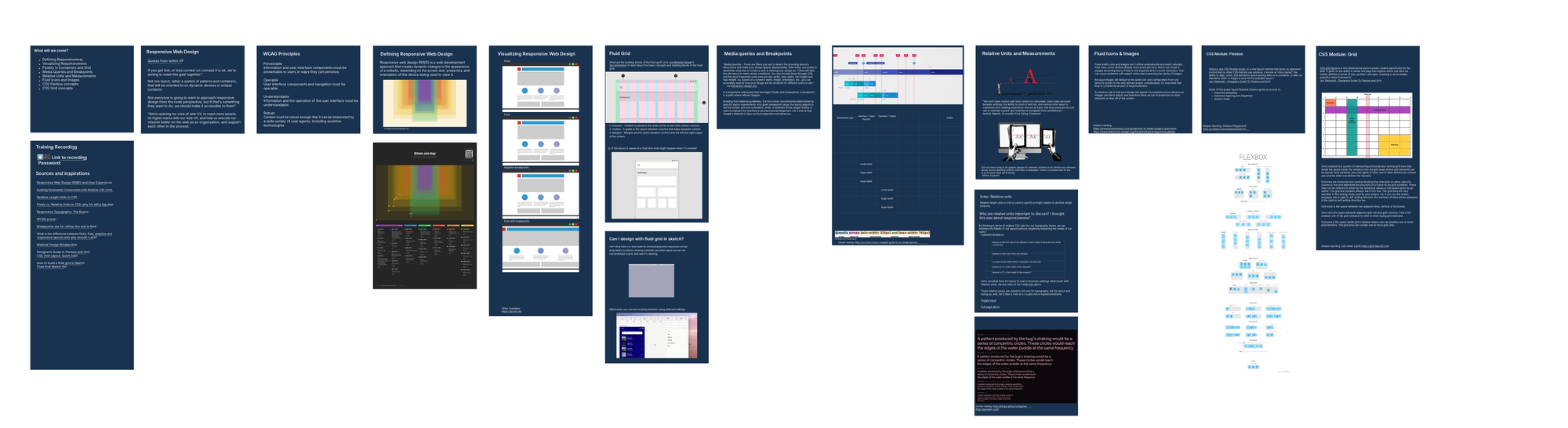
Overview of the slides from the WCAG Resize and Reflow training deck: navy slides with layout diagrams, breakpoint grids, and flexbox examples.
WCAG Resize/Reflow training deck, 2022. Drag to look around, or zoom out to see it all.

For 350+ engineers, I focused on the fundamental concepts behind Resize and Reflow, and the CSS modules that enable them. The training reoriented how they thought about layout: not just screen sizes, but the core goal of keeping content perceivable, understandable, and robust.

For 50+ designers and PMs, I focused on shared language, writing accessibility acceptance criteria, and annotation. That's where the disconnect usually lives. I built an annotation library for communicating testable, specific a11y AC that engineers could implement without guessing.

Together the two curricula reached 400+ people and became the foundation of Virgin Pulse's WCAG AA compliance strategy, a contractual Section 508 requirement the org had been struggling to fulfill before I joined.

As the team had needs, during this period, I also took on UX design work across multiple streams, including our pattern library team, gamification/rewards team, and platform team, which was working on a Partner Platform API documentation page.

My ability to communicate effectively with my technical colleagues helped me incorporate their technical guidance into our UX design process so that in the end, we delivered artifacts that not only met our UX goals, but also exceeded our accessibility, performance, and usability standards up to that point.

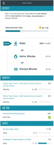
Mobile prototype of a How to Earn screen listing steps, active minutes, and workout minutes with progress bars toward daily, monthly, and one-time rewards.
Rewards for Steps Prototype, 2022
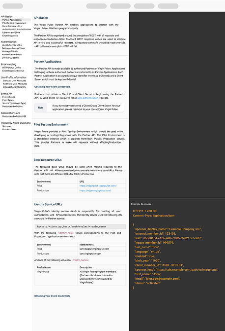
Partner API documentation page prototype with a navigation column, explanatory text in the middle, and example JSON responses in a dark code panel.
Partner API prototype, 2022. Scroll the page: each section's example response sits beside it.

Infosec@Akamai: Embedded Role Within Akamai’s Infosec Team

Sr. UI/UX Developer / Designer · Task analysis, custom card-sorting tool, wireframes, prototypes

2019 marked my first hybrid UX design/development role. I joined the Infosec team at Akamai, which is a global content delivery network, responsible for serving around 30% of all web traffic.

Users within Akamai’s Infosec team needed a more efficient way to ensure product owners maintained their compliance and vulnerability testing cadence.

Using task analysis interviews with Infosec stakeholders, I learned their current workflow involved reviewing data from vulnerability scanning software, compliance data from internal APIs, intranet calendars, spreadsheets, and data from NIST.gov.

In collaboration with them, we began sketching ways we might unify these sources of information, reduce the steps, and give immediate feedback on whether a product contained a critical vulnerability on track for compliance.

  • Akamai's public traffic statistics, 2019
  • Early cadence concept, 2019
  • Vulnerability scan initial wireframes, 2019
  • Initial wireframe with Infosec team, 2019
  • Vulnerability component prototype, 2019

With so many sources of data, as well as multiple user types, I worked closely with many of the Infosec team’s compliance experts near-daily. I used remote and in-person card sorts to build our information architecture around their expectations, and would quickly bring those learnings into wireframes and iterate using their feedback.

Impact: Ultimately, I’d design, iterate, and rapidly move our user-centered designs into front-end prototypes and user flows they could interact with. This user-centered design and evaluation process helped us craft a tool they could feel confident in, and be sure it was designed with their precise critical workflows in mind.

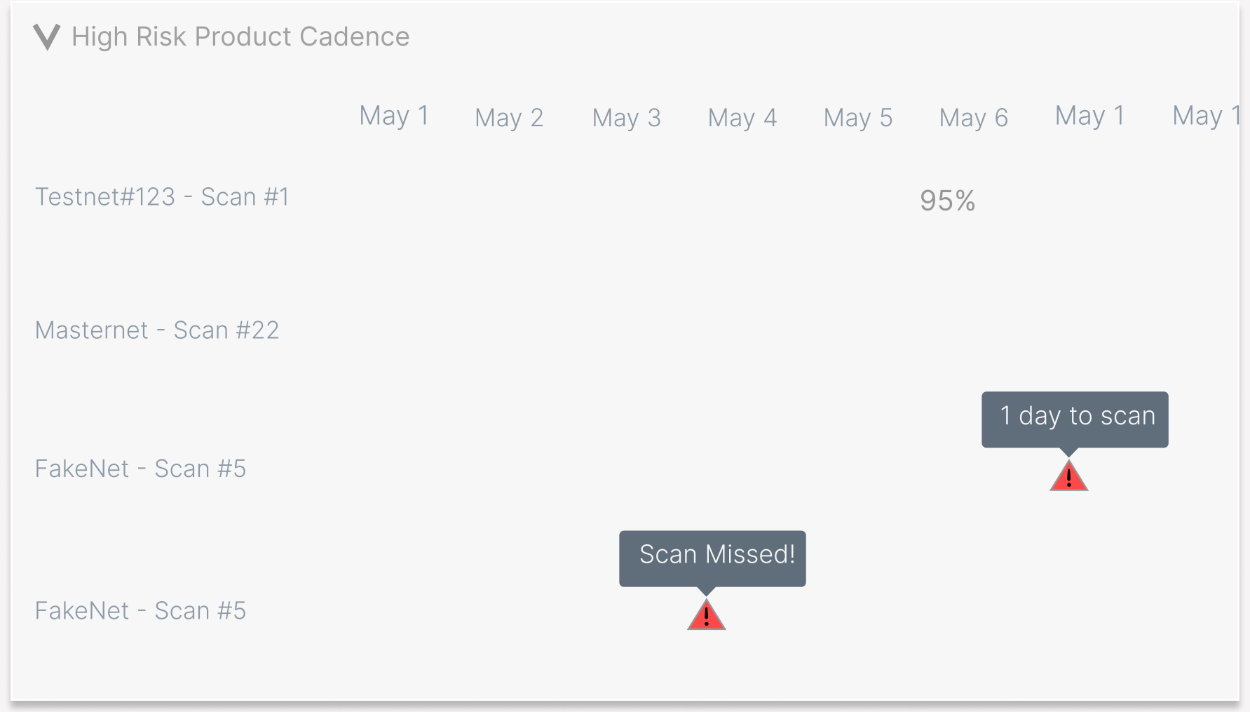
Compliance calendar wireframe showing each product's scans across months, with flags for a scan due in one day and a missed scan.
Compliance calendar wireframe, 2019. Choose a marker for its detail.
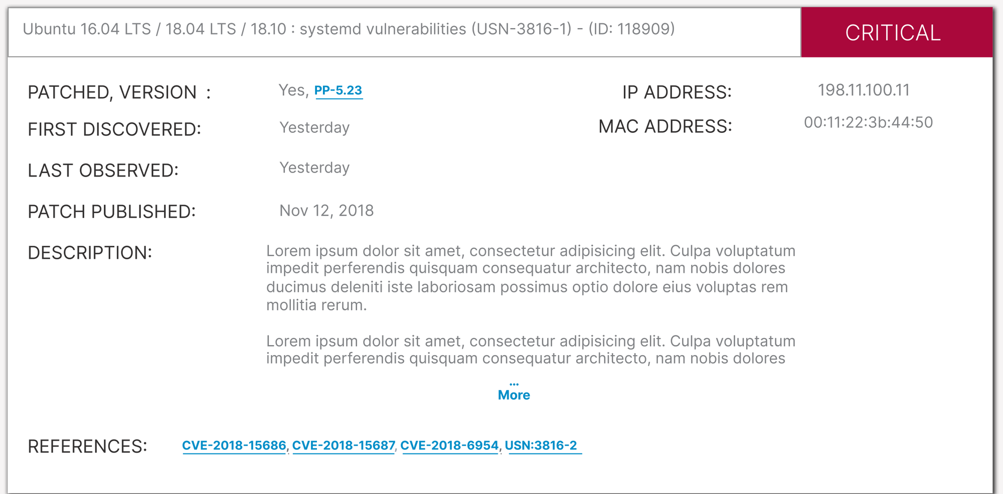
Vulnerability card prototype for an Ubuntu systemd vulnerability marked Critical, with patched version, first discovered, last observed, patch published, IP and MAC address, a description, and CVE references.
Vulnerability card prototype, 2019

Eastern Bank: Seeing the UX/Dev Collaboration Puzzle From the Developer’s POV

UX Developer, Eastern Labs · SCSS framework, interaction design, WCAG audits

At Eastern Bank's Innovation Lab I spotted a bottleneck that was causing friction for everyone else on the UX team: designers and engineers were iterating in parallel but speaking different languages, and it was costing the team time with daily tweaks.

I built a standardized SCSS framework as a Rosetta stone between them. Designers could make systemic changes without touching code. Engineers could maintain DRY, efficient architecture without babysitting design drift. The friction wasn't fully removed, but we could now quickly and efficiently respond to design iteration without the pain of major refactors.

Over the next two years I grew into my UX Developer role, going deep into WCAG audits and compliance-sensitive work in finance, and teaching people Flexbox along the way.

What I still use: The habit of asking which side of the design/engineering divide a problem is actually coming from before trying to solve it.

  • Interaction design and UI development, 2017
  • Interaction design and state animations, 2017
  • Sign-in prototype: floating labels, a show-password toggle, the forgot-username flow, and choosing how to receive a security code.

Early Work

First-time founder · UX research, user flows, state flow diagrams

In 2010, before fully putting on my designer hat, I was a first-time founder having to wear all of them. I recognized the value of UX research and design in my work promoting economic mobility, and applied these principles to my work through user testing, iteration, and data analysis to seek product-market fit. My UX research included creating user flows, data flow, and state flow diagrams.

  • State and Data flow diagrams, 2010
  • Concept data flow, level 0, 2010
  • Mass audience test data flow, 2010

Experiments: Art, Interaction Design, and Animation

Own work, open source · ReAnimate.css, Art@60fps, Swirl Together

I've been making art with code and designing how people play with it since 2014, from pure-CSS experiments to a painting app at Steam Next Fest.

In 2014 I took off the founder hat and picked up two new ones: JS developer and interaction designer. I became fascinated with mastering performant animations and interactions and used art and open-source experiments to practice. I released an interaction library, ReAnimate.css, in 2015.

What I still use: The habit of thinking about rendering and state before reaching for an animation. Performance and craft aren't in tension if you understand the DOM well enough.

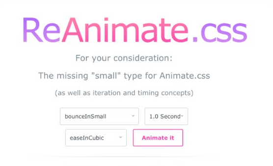
ReAnimate.css homepage with a pink gradient logo and dropdowns for animation type, duration, and easing next to an Animate it button.
Homepage of ReAnimate.css, running here
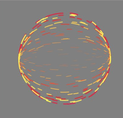
Art@60fps: red, orange and yellow star-cut rings turning in 3D.
Art@60fps using HAML, and SCSS nth-child iteration, 2015 (CodePen)

Swirl Together: Art Therapy From Prototype To Production

In 2017 Pavel Dobryakov posted a fluid simulation using WebGL shaders and the Navier-Stokes equations, and it blew my mind. It showed me a level of browser performance I'd never seen before, fluid dynamics that felt more tactile and alive in a browser tab than some native programs I’d used.

Over the years, as I grew as a UX designer and developer, I felt more empowered to stand on the shoulders of the people who inspired me. So, I forked it on CodePen and started prototyping a new UX around it. I added controls directly into the shader and shared it with friends who were artists and engineers. Seeing Chris Coyier (the creator of CodePen), a person whom I’ve admired for years, leave a heart on the prototype was a huge honor.

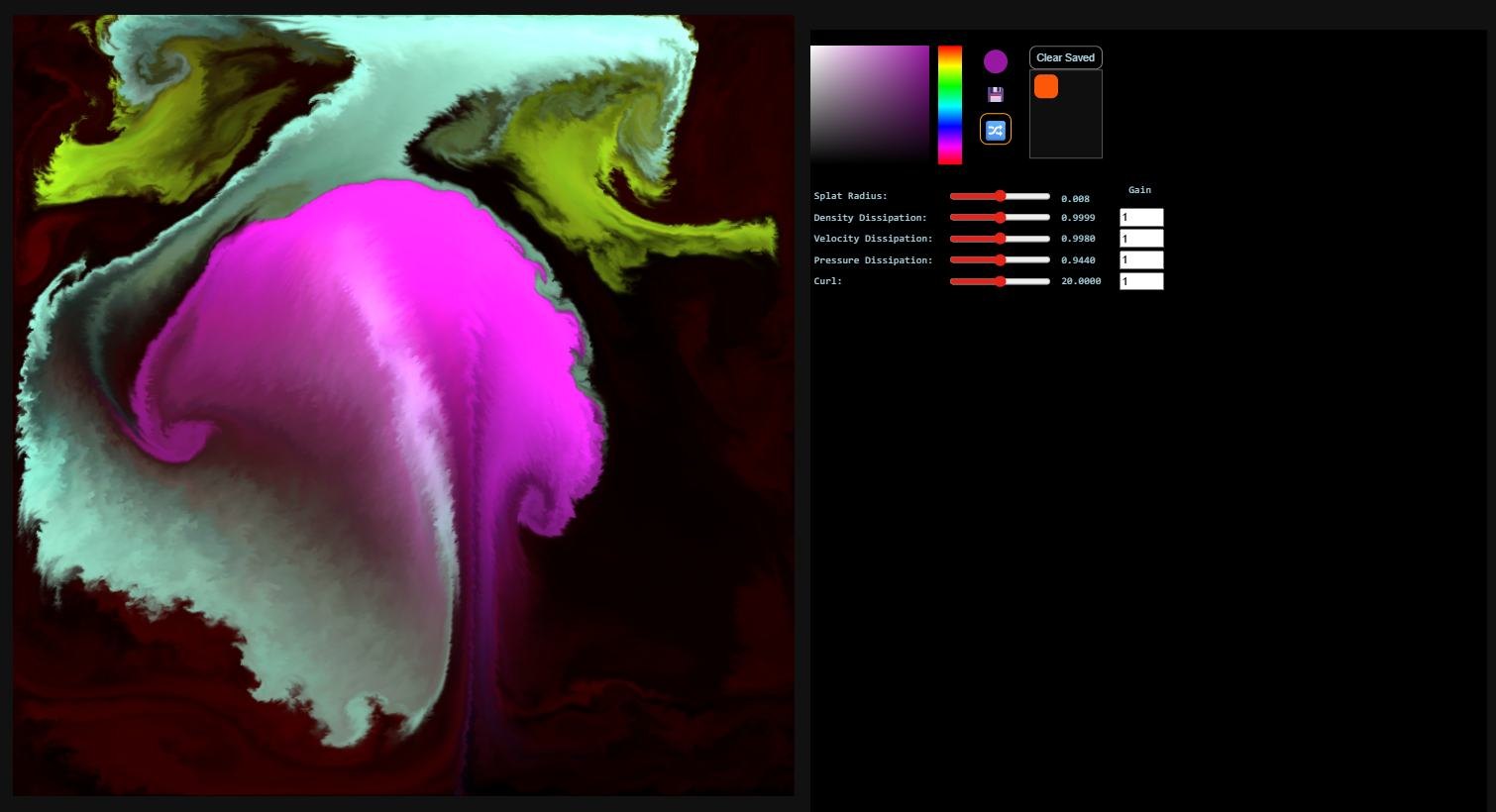
Early prototype: a magenta and green fluid painting beside a plain black panel of color pickers and unlabeled sliders.
Original Prototype built on Pavel’s Fluid Sim, Circa 2022

That simple heart was confirmation to give the prototype all I had. User testing with art therapists helped me understand where the information architecture fell short, so I reworked it: reshaping inputs to prevent errors, rewriting labels to be understandable at a glance, and interaction details that make it feel built with love, like presets that glide every slider to its new position the way an audio mixer does.

Accessibility was part of the foundation, not a final pass. Every control works from the keyboard, with a skip link and visible focus rings. Every slider has a name a screen reader can announce. A simplified layout keeps beginners from being overwhelmed, while power users can turn everything on.

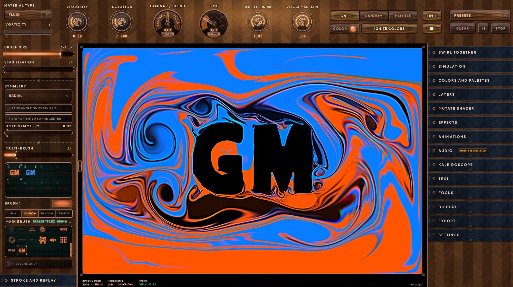
The result is Swirl Together, a desktop and browser-based art therapy tool with a full parameter system, collision masking (pictured), audio reactivity, stroke recording and replay, and a Mutate engine that makes a deep system approachable without dumbing it down.

Swirl Together's painting screen: a bold orange and blue fluid swirl with the letters GM masked out of it, framed by walnut and copper control panels with dials for viscosity, curl, and brush size.
Swirl Together, 2026. Opens the live playtest in a dialog.